Your visual branding is either building trust or destroying it: there's no middle ground.
Every day, your brand makes thousands of silent impressions. A logo that doesn't scale properly. Colors that shift between platforms. Generic stock photos that scream "amateur hour." These seemingly small details are costing you customers, credibility, and competitive advantage.
The brutal truth? Most businesses are making critical visual branding mistakes without even realizing it. While you're focused on operations and growth, your brand identity is quietly sabotaging your success.
Here are the seven most damaging visual branding mistakes that are holding your business back: and the proven fixes that will put you ahead of competitors who haven't figured this out yet.
Mistake #1: Inconsistent Visual Elements Across Platforms
The Problem That's Killing Your Recognition
Your logo looks different on your website than it does on LinkedIn. Your brand colors shift between your email signature and your business cards. Your typography changes from one marketing piece to another.
This inconsistency doesn't just look unprofessional: it actively confuses your audience about who you are.
When customers can't recognize your brand at a glance, you lose the compound effect of every marketing dollar you've ever spent.
Think about it: Apple's visual identity is so consistent that you'd recognize their aesthetic from across a crowded room. That didn't happen by accident.
The Fix
Create a comprehensive brand style guide that becomes your visual bible. Document everything:
- Exact brand colors with specific hex codes
- Approved fonts for headers, body text, and accents
- Logo usage rules including minimum sizes and clear space requirements
- Spacing and layout guidelines
- Do's and don'ts for every application
Then enforce it ruthlessly across every platform. Your website, social media, email campaigns, business cards, presentations: everything should follow these guidelines without exception.
How The Wann Agency helps (so it actually sticks)
- Brand Audit + Style Guide: We build a practical, enforceable brand system (not a pretty PDF that no one opens). Frontify/Brandfolder-ready, with real-world examples for web, social, print, and sales decks.
- Ready-to-Use Tools: Figma libraries, Canva Brand Kits, Google Slides/PowerPoint templates, email signature kits, and social post frameworks so your team can ship consistent assets fast.
- Marketing Leadership: On-demand brand governance to review assets before they go live. We set approval workflows in Asana/ClickUp and give your team “do this, not that” guardrails.
- QA Across Platforms: We test on Webflow/WordPress, LinkedIn, Instagram, Mailchimp/HubSpot, and print vendors to catch color shifts, logo mis-sizing, and font fallback issues.
- Team Training: 60-minute playbook sessions with designers, sales, and ops so everyone knows how to use the system—plus a searchable micro-site your team can reference anytime.
Example: A multi-location healthcare group unified 120+ touchpoints in 6 weeks using our brand system + templates, cutting rework by 35% and boosting social brand recognition in surveys within one quarter.
"Consistency compounds. Every aligned impression makes the next one easier."
Mistake #2: Overcomplicating Your Logo Design
The Problem That Shrinks Your Impact
Complex logos with intricate details, illegible fonts, or multiple elements become unrecognizable disasters when scaled down. That elaborate design might look impressive on your business card, but it disappears entirely as a social media profile picture or email signature.
If your logo doesn't work at 50 pixels, it doesn't work at all in today's digital world.
The Fix
Design with scalability as your primary concern. Test your logo at various sizes: from billboard scale down to favicon size.
Key principles for scalable logo design:
- Keep it simple and clean
- Avoid thin lines that disappear when reduced
- Test in black and white to ensure it works without color
- Ensure it remains readable at any size
- Remove unnecessary details that add complexity without value
How The Wann Agency helps (from sketch to favicon-ready)
- Responsive Logo System: We design primary, horizontal, stacked, and mark-only variants that hold up from 50px avatars to trade show signage.
- Scalability Testing: Automated legibility tests at common breakpoints (16–24px favicons, 48px social avatars, 120px email headers). Black/white, low-contrast, and night mode checks included.
- Pro File Delivery: Clean SVGs, hinted vector paths, print-ready EPS, and optimized PNGs—plus usage specs for Shopify/Squarespace, Google My Business, and email clients.
- Real-World A/B: We test avatars and lockups on LinkedIn/X/Instagram to validate recognition and click-through before you roll out.
Example: After we simplified and “weight-balanced” a SaaS platform’s mark, social profile clarity improved immediately and avatar click-through rose by double digits while support tickets like “your logo is unreadable” dropped to zero.
Your logo should be instantly recognizable whether it's displayed at 500 pixels or 50 pixels.
Mistake #3: Using Generic or Low-Quality Visuals
The Problem That Screams "Amateur"
Blurry photos, obvious stock imagery (hello, handshake photos and people pointing at laptops), and low-resolution graphics instantly signal to your audience that your brand lacks professionalism and attention to detail.
Poor visuals undermine credibility before your audience even reads your message.
Generic imagery also makes you blend into the background noise of every other business using the same tired visual clichés.
The Fix
Invest in high-resolution, authentic visuals that reflect your unique brand personality. Here's your action plan:
- Commission custom photography that tells your specific brand story
- If using stock photos, choose premium platforms with unique, less-used imagery
- Ensure all images are high-resolution for both digital and print applications
- Maintain consistent editing style across all visuals (same filters, color grading, etc.)
- Avoid overused visual clichés that make you look like everyone else
How The Wann Agency helps (visual storytelling that converts)
- Custom Shoots + Art Direction: Shot lists, scene plans, and brand photo playbooks so every image supports your narrative. We deliver Lightroom presets for consistent grading across campaigns.
- Smart Stock, Made Yours: Premium stock curation (Stocksy, Offset, Adobe Stock Premium) edited to your palette and style—so nothing looks “stocky.”
- Content Library Buildout: B-roll, short video loops, and social cutdowns packaged in Brandfolder/Dropbox with naming conventions and usage rights.
- Tools You Can Use: Notion-based content calendars, Canva Pro kits for field teams, and repeatable creator briefs for UGC partners.
Example: A professional services firm replaced cliché stock with a custom brand shoot and on-brand stock edits; time-on-page rose significantly and demo requests increased in the next campaign cycle.
"Authentic visuals are trust signals. If it looks real, it feels reliable."
Every visual element should reinforce your brand's professionalism and distinctiveness.

Mistake #4: Ignoring Color Psychology and Scalability
The Problem That Weakens Your Message
Choosing colors based on personal preference rather than strategic psychology is like building a house without blueprints. Colors that look vibrant on your computer screen might appear dull in print, and trendy choices can quickly feel outdated.
Color psychology isn't optional: it's a fundamental part of how humans process and remember brands.
Different colors trigger different emotional responses and associations. Financial institutions use blue for trust and stability. Restaurants use red to stimulate appetite. These aren't coincidences.
The Fix
Research color psychology specific to your industry and target audience before finalizing your palette. Consider what emotions and associations you want to trigger.
Strategic color system framework:
- One dominant primary color that represents your core brand
- Two to three complementary colors for variety and depth
- Two accent colors for highlights and calls-to-action
- Test across multiple formats: digital screens, print materials, mobile devices
How The Wann Agency helps (color that works everywhere)
- Strategy + Psychology: Workshops to align palette choices with buyer psychology and category cues (trust for fintech, energy for CPG, calm for healthcare).
- Accessibility First: WCAG 2.2 AA/AAA contrast checks with Stark/Contrast plugins, plus dark-mode and low-light variants.
- Systematized Tokens: We translate your palette into design tokens (Figma Tokens/Style Dictionary) for dev teams and into Pantone/CMYK/HEX/RGB for print.
- Print + Screen Proofing: Soft-proofing across devices and hard proofs with your print vendors to prevent costly surprises.
- Activation Guidance: Data-viz colors, CTA contrasts, and use cases by channel (paid social, email, landing pages).
Example: A regional bank shifted to a deeper primary blue with a warm accent guided by our tests; trust scores improved in customer surveys and landing page CTA conversion lifted after contrast refinements.
Ensure your colors maintain their impact and meaning across every application.
Mistake #5: Creating Cluttered Visual Layouts
The Problem That Overwhelms Your Audience
Cramming text, images, icons, and calls-to-action into every available space creates visual chaos. When everything is competing for attention, nothing gets attention.
Cluttered designs don't communicate more: they communicate less effectively.
Your audience's eyes don't know where to look first, so they often don't look at all.
The Fix
Embrace the power of white space and visual hierarchy. White space isn't empty space: it's the element that makes everything else work.
Essential layout principles:
- One clear primary message per design
- Use contrast, size, and spacing to guide attention naturally
- Create breathing room around important elements
- Establish clear visual hierarchy from most to least important
- Remove elements that don't directly support your main objective
How The Wann Agency helps (clarity that converts)
- Content Hierarchy First: We wireframe pages, ads, and decks to define message order before pixels—so design serves strategy.
- Component Libraries: Reusable blocks (hero, proof bar, pricing, CTA) in Figma/Webflow so every layout follows proven patterns.
- Performance Feedback Loops: Heatmaps/session replays (Hotjar), scroll-depth and CTA tracking (GA4/HubSpot) to iterate layouts based on real behavior.
- Sales-Ready Templates: Clean one-pagers, case study sheets, and pitch decks with built-in hierarchy—less clutter, more clarity.
Example: After reorganizing a B2B site’s layout and tightening component spacing, bounce rate dropped and click-through to primary CTAs increased across top landing pages.
"Space isn’t empty—it’s emphasis. Make the important things impossible to miss."
Your headline, key benefits, and call-to-action should stand out naturally without fighting for attention.

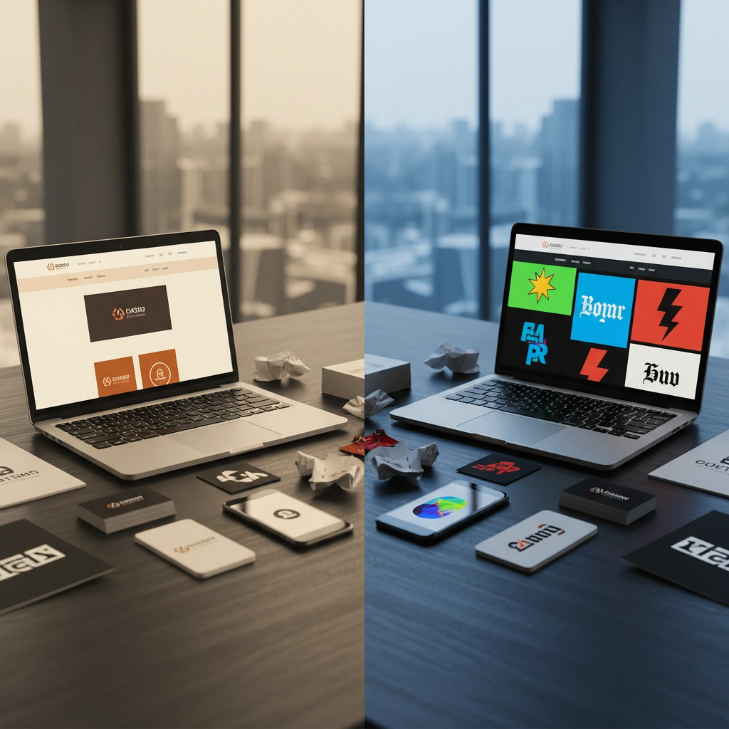
Mistake #6: Using Too Many Colors
The Problem That Dilutes Your Identity
A color palette with six, seven, or more colors creates visual confusion and dilutes brand recognition. This scattered approach is often a telltale sign of amateur branding work.
Too many color choices paralyze decision-making and weaken brand memory.
When everything is highlighted, nothing is highlighted.
The Fix
Simplify your palette with strategic intention:
- Two primary brand colors that define your identity
- Two to three complementary colors for supporting elements
- One to two accent colors for highlights and special emphasis
How The Wann Agency helps (palette discipline made easy)
- Palette Rationalization: We audit your current assets, identify duplicates and off-brand shades, then tighten to a right-sized system.
- Guardrails in Your Tools: Figma libraries, Canva Brand Kits, and locked color styles so teams literally can’t pick random hues.
- Governance + Refresh Cadence: Light quarterly reviews to keep the palette tight as new campaigns roll out.
Example: A DTC brand cut its “rainbow problem,” aligned product labels and ads to four core colors, and saw faster production cycles with fewer revisions across partners.
This structured approach creates visual cohesion while providing enough variety for engaging designs. Ensure all colors work harmoniously together and reinforce your overall brand personality.
Mistake #7: Not Aligning Design with Brand Personality
The Problem That Creates Disconnect
Copying competitor aesthetics or chasing design trends without considering your authentic brand personality creates a disconnect between who you are and how you appear.
A playful startup shouldn't look like a conservative law firm, and vice versa.
When your visual identity doesn't match your brand personality, you confuse your audience and attract the wrong customers.
The Fix
Define your brand personality first, then ensure every design decision reinforces that personality:
- Bold and innovative brands need dynamic, forward-thinking design
- Luxury brands require elegant, sophisticated aesthetics
- Playful brands can embrace color, movement, and creative elements
- Traditional brands should emphasize stability, heritage, and trustworthiness
How The Wann Agency helps (strategy before style)
- Brand Strategy Workshops: Positioning, audience personas, and archetype mapping to define who you are—before we pick colors or fonts.
- Visual Storytelling System: Moodboards, reference libraries, and examples that show exactly how personality shows up in imagery, motion, and layout.
- Messaging + Voice: We align copy tone with visuals so your story feels consistent across site, sales, and socials.
- Creative Direction: Ongoing leadership to keep agencies, freelancers, and internal teams aligned—no trend-chasing detours.
Example: We repositioned a B2B logistics brand from “generic vendor” to “relentlessly reliable partner.” The refined visual language plus focused messaging improved lead quality and shortened the sales cycle.
Your color choices, typography, imagery style, and design approach should work together to communicate your unique brand story authentically.
When design reflects genuine brand personality rather than following trends, it creates emotional connections with your target audience and differentiates you from competitors.
The Bottom Line
Visual branding isn't decoration: it's strategic communication.
These seven mistakes are silently costing businesses customers, credibility, and competitive advantage every single day. The companies that recognize and fix these issues will pull ahead while their competitors continue making the same costly errors.
At The Wann Agency, we've helped countless businesses transform their visual branding from liability to competitive advantage. Our strategic approach to visual identity goes beyond making things look pretty: we create cohesive brand systems that build recognition, trust, and lasting customer connections.
Ready to audit your visual branding and identify which of these mistakes might be holding you back? Let's have a conversation about how strategic visual branding can accelerate your growth and set you apart from the competition.
Your brand deserves better than amateur mistakes. The question is: will you fix them before your competitors do?